Your technical diagrams sucks
Do your technical diagrams looks like this?
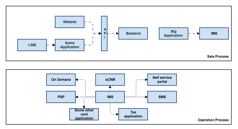
Most of the time they're so generic they don't help me at all to understand the system. Sometimes they're so specific that without context they're useless. In both cases they're not helping you the reader understand anything. First time I saw this diagram immediately I had following questions:
- Where do I start on this diagram? I see the diagram shows a website and some kind of application? What business value do they bring? What do they do?
- I'm new here what do the acronyms stand for. Yes I know API but IMS, PSP, ...
- What do the lines do?
- Why is there a separation between sales process and operations process. Why is business flow mixed with technical flow?
- How can a sales process be about a website talking to API which talks to the backed? Who does sales like this?
These diagrams are used as supporting material. Hopefully you receive relevant information during a meeting or by a supporting document. I believe strongly that a diagram should stand alone.
Diagrams are hard like writing is. Most diagrams are drafts where the author did a brain dump. After writing a first draft we should spend time on editing the diagram. Like in writing there are several website providing tips to improve. There is a good (book)[https://www.amazon.com/Writing-Well-Classic-Guide-Nonfiction/dp/0060891548] how to up your writing game.
Improvement tips
Understand the primary use
All diagrams and documentation in you're project are used to communicate and learn. You are communicating the design of a software system. People will use it to learn how to design it or even how it is working after it has been delivered.
Target audience
Who are you writing these diagrams for? The team that is going to work or is working on it? Outside stakeholders? Even operational and support people? Depending on the context of the audience you need to adjust the information provided..
Good diagrams should stand alone
Most of the time diagrams like the above are used to support a meeting to inform people. It should be the other way. There should be no need for extra narratives on the diagram. They should compliment the diagram but are not needed to make sense of the diagram.
Put some effort in the readability of the diagrams. You can put narratives in the diagrams too.
Separate different contexts
As in the diagram above you can see:
- system context
- application context
- application components
- infrastructure
Separate these contexts and keep everything in a different diagram.
Similar levels of abstraction provide a way to compare solutions.
Explain arrows
This is a small power tip to improve your diagrams.
Better demonstrated with an example:
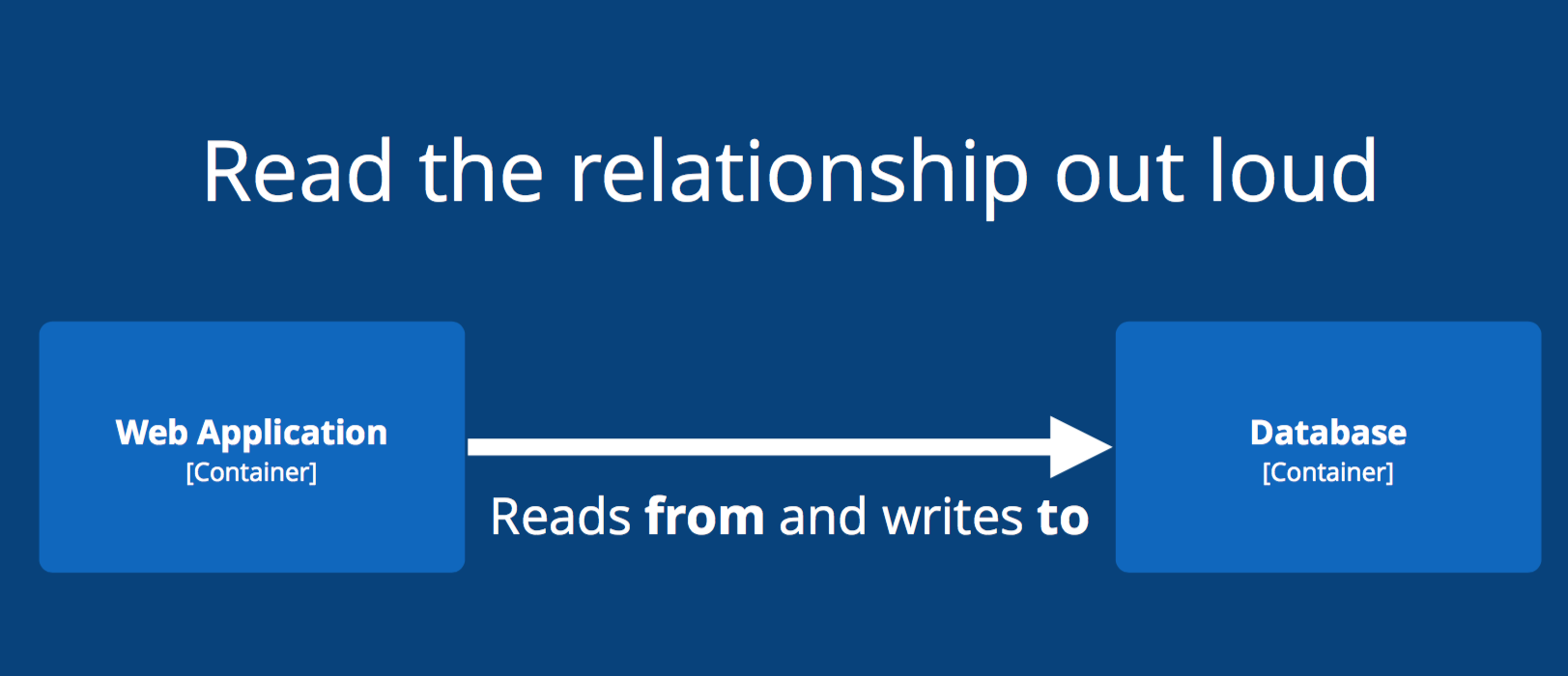
So you can write all you're diagram flows in nice full sentences:
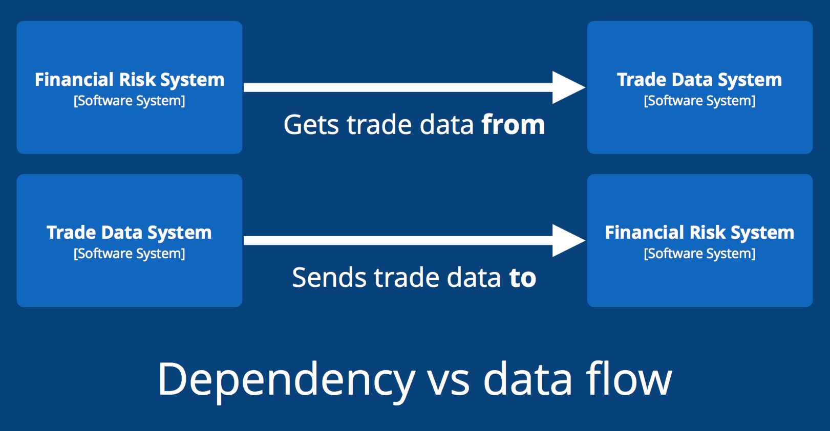
It will help to read and understand the diagram better.
Next Post: Explaining how the C4 model can help you writing better diagrams